Use Pyscript to Build a Python Dashboard Web App (2024)
A Step-by-Step Tutorial to Creating Web Applications using just Python and HTML.
Introduction
If you’re a Python Programmer, Data Scientist, Web Developer, or just an everyday Python user who wants to deploy python projects to a web page or build simple web applications using just Python and no JavaScript — Pyscript is for you.
First of all, what is Pyscript?
Pyscript is an open-source platform developed by the Anaconda team that allows developers to build python applications in the Browser that do not require servers to run. It was released in 2022 at the PyCon US Summit and aims to simplify the distribution of Python applications across web pages.
Anaconda blog says “Pyscript is just HTML, only a bit (okay a lot) more powerful” and I agree, because it uses the same straightforward HTML syntax but is configured with extra and easy-to-use capabilities.
“Pyscript isn’t meant to take the role of JavaScript in the browser, though — rather, it’s meant to give Python developers …. more flexibility and power.”-source.
What’s cool is it can also be integrated with CSS, JavaScript, Flask, and other libraries.
This tutorial will guide you on using Pyscript in 2024 by building an interactive data dashboard. By the end of this tutorial, you’ll have the technical knowledge needed to understand Pyscript, configure it for your projects and handle any errors.
Why Pyscript?
Python is a popular and beginner-friendly programming language, however, integrating Python with web technologies has traditionally been challenging. Pyscript bridges this gap by allowing developers to create web applications without needing deep knowledge of web technologies. This is particularly beneficial for:
Developers seeking to share Python applications or dashboards with users who may not have Python installed on their computers.
Data scientists and machine learning practitioners who want to deploy their models and visualizations on the web.
Individuals looking to create personal projects or portfolio sites using Python, making it easier to host and showcase their work.
Prerequisites for this tutorial
To get the most of this tutorial all you need is a basic understanding of Python and HTML.
How Pyscript Works and Things to Note
Pyscript runs in the browser because it is primarily supported by Web Assembly (WASM) and Pyodide.
Web Assembly often abbreviated as WASM, is a technology that allows programs written in different languages (like C, C#, Python etc.) to run in web browsers. It helps make web applications faster and more efficient. In Pyscript, it runs the python interpreter in a format suitable for the web.
Pyodide loads the latest version of Python and provides access to Python modules. Pyscript loads itself and Pyodide before executing Python scripts.
The major building block of Pyscript is a framework called Polyscript. Polyscript enables embedding of programing languages into HTML pages using <script> tags, allowing for interaction between these languages and the web environment. Pyscript then, is a version of Polyscript configured to the Python interpreter- this means the core of Pyscript functionalities are derived from Polyscript’s ability to handle the dependencies required for Python execution. For now, that's all you need to know. You can see Polyscript's documentation to learn more about this tool as that is beyond the scope of this tutorial.
Please note:
Pyscript runs python in the browser; it doesn’t use the python version installed on your computer. It is built on Pyodide which runs the latest version of python and executes your code safely within the browser.
When using Pyscript, the version you choose is important. Different versions have different capabilities; and because these features might not sync across all versions, it could lead to errors. It’s a good idea to check the versioning information to understand these differences.
Pyscript runs a little slower than other web technologies like JavaScript. This is because Pyscript uses Web Assembly which needs to be fully set up each time the browser reloads, whereas JavaScript is built into the browser. Web Assembly cannot also be cached in your browsing sessions.
💡Having a knowledge of this can help you optimize performance and to know if a complication is beyond Pyscript. For example, if your packages take up much time to install, that’s not a Pyscript problem, it‘s likely a Pyodide problem — which can be fixed by running Pyodide within web workers.
Without further ado, let’s get straight to the dashboard.
About the Data
The data we’d be working with is my personal water intake data gotten from my Health Tracker. Here is what the data looks like.

This data is limited to the year 2024 and has been formatted and cleaned for analysis. If you want to see how that was done, check out this GitHub repository.
The HTML File
To begin working with Pyscript, ensure you have the following set up in your HTML file:
CSS Reference: Include a link to Pyscript’s CSS file within the
<head>tag of your HTML document. This is not required but helps style the Pyscript elements on your page.JavaScript Bootstrap: Also, in the
<head>tag, add a link to Pyscript’s Javascript file. This script initializes Pyscript’s features and connects to the platform's resources on the Content Delivery Network (CDN).Environment Configuration: If your project requires specific Python packages, use the
<py-config>tag to list them. This tag tells Pyodide the necessary packages to install for your Pyscript application.Pyscript Tag: The
<py-script>tag is where you’ll write or reference your Python scripts and is placed within the<body>of the HTML.
Now, let’s construct the HTML structure for the dashboard.
<!DOCTYPE html>
<html lang="en">
<head>
    <meta charset="UTF-8">
    <meta name="viewport" content="width=device-width, initial-scale=1.0">
    <link rel="stylesheet" href="https://pyscript.net/alpha/pyscript.css" />
    <script type="module" src="https://pyscript.net/releases/2024.5.2/core.js"></script>
    <script src='https://cdn.plot.ly/plotly-latest.min.js'></script>
    <link href='https://unpkg.com/boxicons@2.0.9/css/boxicons.min.css' rel='stylesheet'>
    <link rel="stylesheet" href="https://fonts.googleapis.com/css2?family=Material+Symbols+Outlined:opsz,wght,FILL,GRAD@24,400,0,0" />
    <link rel="stylesheet" href="styles.css">
    <title>Water Dashboard with PyScript</title>
</head>
<body>

</body>
</html>
Link 1 points to Pyscript CSS initial release. I used the initial release because it looked better for my page than other versions.
Link 2 points to Pyscript JavaScript’s second release in May 2024 (the latest release at the time of writing this tutorial).
Link 3: In this tutorial, the Python charts will be created using Python’s Plotly module. We therefore link to a CDN to display the charts because Plotly charts cannot be directly rendered in HTML. However, this is not the case for other Python graphing libraries like Matplotlib.
Link 4 and 5 are icon designs for the dashboard: Boxicons and Google Material Design in this case.
Link 6 is an external CSS file, which is optional unless you wish to customize the default appearance. Pyscript also supports writing CSS styles within your Python script.
Pointing to a Pyscript Release
Pyscript versions use CalVer, which take the form of year.month.counter, as in <script type="module" src="https://pyscript.net/releases/year.month.counter/core.js>. In our case 2024.5.2 points to the 2nd release of Pyscript in May 2024. The good thing is older versions are not deleted; they are stored in a separate repository to give users the flexibility to update their versions at will.
<py-config>
The <py-config> tag tells Pyodide which Python modules and dependencies to install for your project. This tag is typically placed at the end of the <head> section, following the <title> tag. While this placement is conventional, it’s essential that the <py-config> tag remains within <head> to ensure proper loading. You can also specify the exact versions for each package. The<py-config> tag only became available from version 2023.2.0 as a replacement for a similar <py-env> tag in older versions.
For this dashboard, we’d load two Python modules: Pandas and Plotly.
<head>
    <!--the rest of your code-->

    <title>Water Dashboard with PyScript</title>

    <py-config>
        packages = ['pandas','plotly']
    </py-config>
</head>
<body>

</body>
</html>
Behind the scenes, Pyscript first searches for the content of <py-config> and installs the specified dependencies. Here’s what the browser’s console looks like;
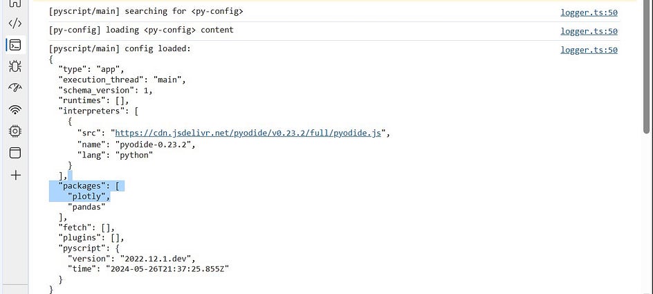
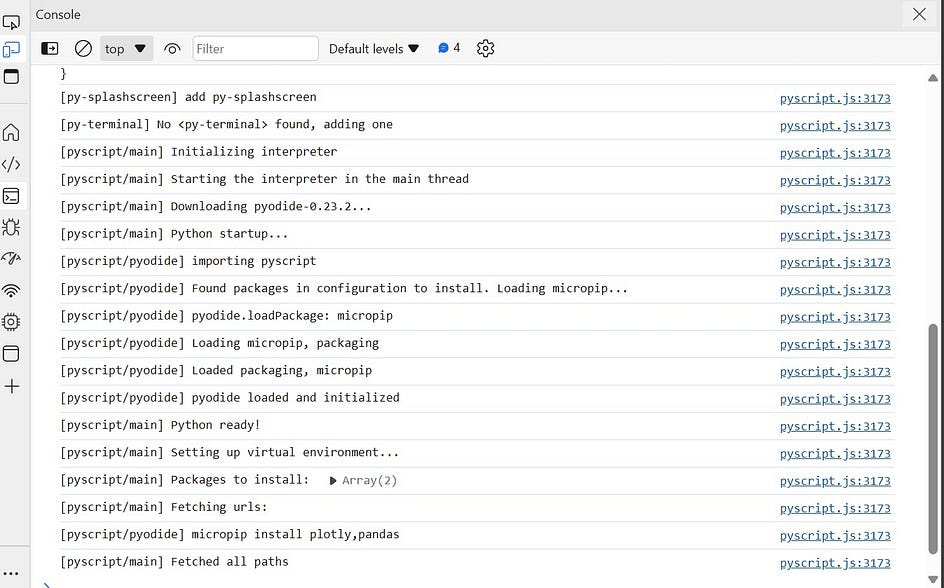
Note that the console information is not as detailed on Pyscript versions above 2022.12.1, I only used this version here to give a picture of how it works.
HTML components
Before we begin, we should have a visual idea of what we want to implement. Drawing from the below image we’d need a sidebar (profile section), a dropdown, three KPI cards, and five python charts: a heatmap, a line chart, a table, an indicator, and a bar chart.
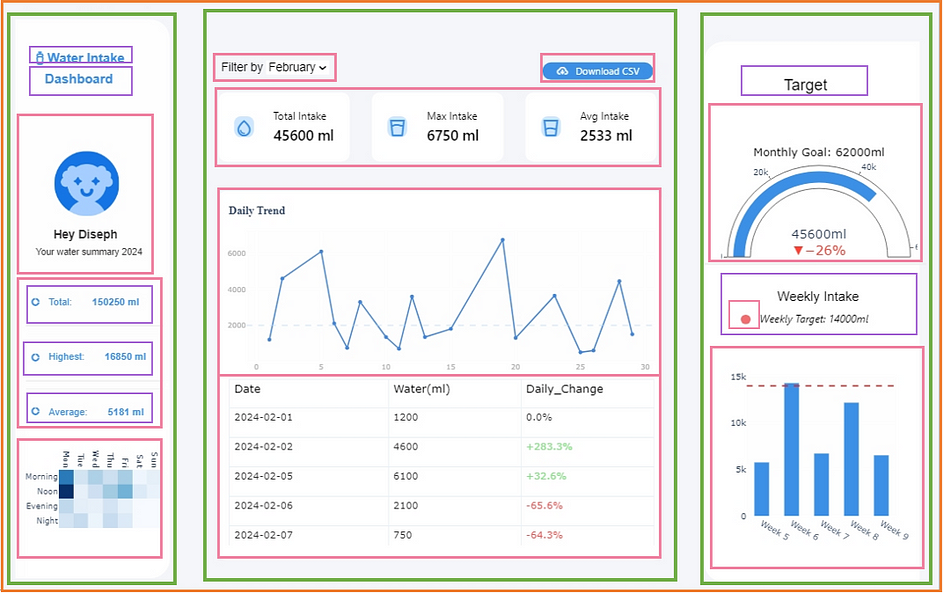
In the image, orange represents the<body>tag, green represents<section>tags, pink represents<div>and purple represents various text tags; having a visual idea makes HTML easier to implement.
Let’s begin with the profile card/sidebar. The<span>and<i>class elements link to the respective icons.
<body>
    <!--SIDEBAR -->
    <section id="sidebar">
        <a href="#">
            <span class="material-symbols-outlined">water_bottle</span>
            <span class="text">Water Intake Dashboard</span>
        </a>
        <div id="sidebar_contents">
            <div>
                <a href="#" class ="profile">
                    <img src="./blue avatar license free.png" alt="profile image" style="width:120px;height:120px;">
                    <div id="welcome-message">
                        <p id="welcome">Hey Diseph</p>
                        <span>Your water summary 2024</span>
                    </div>
                </a>
            </div>
            <div id="content_2">
                <ul class="side-menu top">
                    <li class="total_stats">
                        <a href="#">
                            <i class='bx bxs-doughnut-chart' ></i>
                            <span class="text">Total: </span>
                            <span id="all_total" class="num_text"></span>
                        </a>
                    </li>
                    <li class="total_stats">
                        <a href="#">
                            <i class='bx bxs-doughnut-chart' ></i>
                            <span class="text">Highest: </span>
                            <span id="all_highest" class="num_text"></span>
                        </a>
                    </li>
                    <li class = "total_stats">
                        <a href="#">
                            <i class='bx bxs-doughnut-chart' ></i>
                            <span class="text">Average: </span>
                            <span id="all_avg" class="num_text"></span>
                        </a>
                    </li>
                </ul>
                <div class="heat_graph" id="heat_graph">
                    <div id="heatmap"></div>
                </div>
            </div>
        </div>
    </section>
<ul>) element is given an ID “heatmap” — this will be referenced in the python script as the HTML location to display the heatmap. The same is true for every python element we want to display on the web page; the IDs given to the HTML elements will be referenced in the python file as where the python graphs should be displayed.Next, still in the <body> element, create the dropdown menu and a download button. Note the inclusion of a <py-change> attribute in the dropdown element and a<py-click> attribute in the dropdown element. These define a browser event and links to a python function that will be executed when that event occurs, that is, when a dropdown option is selected, or when the button is clicked. As for now it is yet to have functionality, since the python functions are not defined. It will be discussed in the DOM section of this tutorial.
<!------CENTER---->
    <section class="middle_section">
        <div>
            <div id="filters">
                <label for="filter">Filter by</label>
                <select class="filter" id ="dropdown_menu" py-change="dropdown_event">
                    <option value="January">January</option>
                    <option value="February">February</option>
                    <option value="March">March</option>
                </select>
            </div>
            <div class = "download">
                <a href="#" class="download_button">
                    <i class='bx bx-cloud-download'></i>
                    <button id="download" type="button" py-click="download_file">Download CSV</button>
                </a>
Next, we create the KPI cards, and the placeholders for the various graphs. There’s not much work to it if you are familiar with HTML.
<!--place in the "middle-section", beneath the dropdown-->
    <div class = "center-top">
         <!--KPI section -->
            <div id="kpis" class = "kpis">
                <ul class="metric-card">
                    <li>
                        <span class="material-symbols-outlined">water_drop</span>
                        <span class="text">
                            <p class="box-text">Total Intake</p>
                            <h3 id="total_water" class="box-text"></h3>
                        </span>
                    </li>
                    <li>
                        <span class="material-symbols-outlined">water_full</span>
                        <span class="text">
                            <p class="box-text">Max Intake</p>
                            <h3 class="box-text" id="highest_water"></h3>
                        </span>
                    </li>
                    <li>
                        <span class="material-symbols-outlined">water_medium</span>
                        <span class="text">
                            <p class="box-text">Avg Intake</p>
                            <h3 class="box-text" id="avg_water"></h3>
                        </span>
                    </li>
                <ul>
            </div>
        </div>
        <div>
            <!-- LINE CHART-->
            <div class="line_graph">
                <div id="line_chart">
                </div>
            </div>
            <!--TABLE-->
            <div class="table_graph">
                <div id="table">
                </div>
            </div>
        </div>
    </section>

    <!-- RIGHT SECTION -->
    <section class="right_section">
        <div id="upper_right" class="right_section_charts">
            <h3 id="title">Target</h3>
            <div>
                <!-- CIRCLE CHART -->
                <div id="circle_graph" class="circle_graph">
                    <div id="circle_chart">
                 </div>
                <!-- BAR CHART -->
                <div id="lower_right" class="right_section_charts">
                    <!-- bar chart title -->
                    <h4 id="weekly_intake">Weekly Intake</h4>
                    <div class="target_weekly">
                        <div class="category"></div>
                        <p>Weekly Target: 14000ml</p>
                    </div>

                    <!--bar chart -->
                    <div id="bar_graph" class="bar_graph">
                        <div id="bar_chart">
                        </div>
                    </div>
                </div>
            </div>
        </div>
    </section>
Running the app
Since I’m using VS CODE, I’ll use the “live server” extension to run the HTML file. If you’re not, you can run the app locally on Python’s HTTP server using the terminal.
python -m http.server
<py-script>
That was easy, now we’re ready to link our Python file. This is done using a <py-script> element. You either write all your python code inside of this tag or by linking to an external python file. I prefer linking to an external python file (~app.py in this case) to make the code look more organized.
<body>
    <!--the rest of your code-->

    <py-script output="dashboard" src="./scripts/app.py">
    </py-script>
</body>
src specifies the source file from which the Python script should be fetched, any other code inside of the <py-script> tag would be ignored once this is specified- meaning you can’t link to an external file and still write your Python code within the tag; output points to the HTML element ID to load the script into- but this will not override any referencing you have made in the Python script.As said earlier, Pyscript is built on Polyscript. Behind the scenes, the Pyscript tag is simply a Polyscript reference to the python interpreter in the form of <script type="py"> — type here defines the interpreter to use within the script (Python in this case). We can also use this in place of the <py-script> tag to run the Python file.
<script type ="py" target="middle_section" src="./app.py"> </script>
Linking this way is preferred if your Python script will be inclusive of some HTML, CSS or any non-conventional syntax not compatible with the Python interpreter but is supported by Pyscript.
The Python File
Next, we begin building the Python charts in a Python file “app.py”.
Importing the Modules
Begin by importing all the modules needed; in this case, we need Pandas to wrangle the data, Plotly to create graphs, and warnings to suppress any deprecation messages from being output to the web page. The use of the remaining modules would be shown as we progress in the tutorial.
from js import Plotly
import pandas as pd
import plotly.express as px
import plotly.graph_objects as go
from pyodide.http import open_url
from pyscript import display, document
import warnings
warnings.filterwarnings("ignore")
<py-config> tag configured Pyodide with which Python packages to install, and we only installed Pandas and Plotly. Why not the remaining modules as imported here? — This is because some modules are “global” variables in Pyscript, meaning you do not need to install them again with Pyodide.Loading Files in Pyscript
To load the data files, we either:
- Serve the data through an external server (in this case, GitHub). Then use the
read_csvmethod of pandas to load the csv file, however, sinceread_csvcannot directly access external files, we will use theopen_urlmethod provided by Pyodide.
url = "https://raw.githubusercontent.com/DisephD/Pyscript-Dashboad/main/data/water_data_processed%20(1).csv"

water_data = pd.read_csv(open_url(url), parse_dates=["Date"])
- Load the data through Pyodide: Option (i) points to a url and cannot treat the data as a file, for example, it would be unable to access the data using the
with open (filename, "")context manager. Local files can be made available within Pyscript’s environment using a [[fetch]] syntax inside of the<py-config>tag in our HTML. Assume the name of our data is water.csv in the current directory, the code will be thus;
<py-config>
  packages = ['pandas','numpy','plotly']
  [[fetch]]
  files= ["water.csv"]
</py-config>
JavaScript Module in Pyscript
As earlier said, Plotly charts cannot directly be rendered in HTML, luckily Pyodide provides access to Javascript objects through a JS module.
The JS module allows us to use JavaScript functions and manipulate JavaScript objects directly from Python.
We’ll use a special Plotly method from the JS module; which parses Plotly graphs as JSON before outputting to HTML. To make our code modular, let’s implement this in a Python function which takes two arguments; a Plotly figure and a target HTML id to display the figure. The function first converts the Plotly figure to JSON and outputs this JSON figure to the page.
#create a html representation of a plotly graph
def plotly_to_json (fig, target_id):
    chart_json = fig.to_json()
    Plotly.newPlot (target_id, JSON.parse(chart_json))
Creating the Python Charts
1. Heatmap: a heatmap shows the relationship between two variables. We define a function heat_chart which takes our data; groups, sums and sorts it by the total intake for the “day of the week” and “time of the day”. Using Plotly Express, we create a heatmap from that grouped data and add styling to the chart. Lastly, we make a call to our plotly_to_json() function, passing the heatmap figure and an HTML id as arguments.
def heat_chart (filtered_df):

    heatmap_data = filtered_df.groupby(['Weekday_name', 'Time_of_day'])["Water(ml)"].sum().reset_index()
    custom_order = ['Mon', 'Tue', 'Wed', 'Thu', 'Fri', 'Sat','Sun', ]
    heatmap_data['Weekday_name'] = pd.Categorical(heatmap_data['Weekday_name'], categories=custom_order, ordered=True)

    day_order = ["Morning", "Noon", "Evening", "Night"]
    heatmap_data['Time_of_day'] = pd.Categorical(heatmap_data['Time_of_day'], categories=day_order, ordered=True)
    heatmap_pivot= heatmap_data.pivot_table(index="Time_of_day", columns= "Weekday_name", values= "Water(ml)", aggfunc="sum", fill_value= 0)
    fig= px.imshow(heatmap_pivot, color_continuous_scale='Blues', height=300, width = 240)
    fig.update_traces(showscale=False, coloraxis=None,colorscale= "Blues")
    fig.update_layout(plot_bgcolor="rgb(254,254,254)", title='',margin=dict(t=10,l=0,b=80,r=20),
        xaxis_tickfont_size=14,
        yaxis=dict( title=None, titlefont_size=14, tickfont_size=13),
        xaxis = dict(title=None, tickfont_size =13, side="top", tickangle=90),
    )
    plotly_to_json (fig, "heatmap")
2. Line Chart: A line chart shows changes in data over time. The plotting process is the same for the line chart, but this time we group by the day of the month.
def line_chart (filtered_df):

    daily_total = filtered_df.groupby("Day")["Water(ml)"].sum().reset_index()

    fig = px.line(daily_total, x="Day", y="Water(ml)", height=270, width= 670, markers=True)
    fig.update_traces (marker_size = 6, texttemplate='%{text:.2s}', line_color= "#4587D9")
    fig.update_layout(plot_bgcolor="rgb(254,254,254)", margin=dict(t=50,l=10,b=5,r=10),
                      title= "Daily Trend", title_font_family ="Times New Roman Black",
                      title_font_size = 17, title_x = 0.01, xaxis_tickfont_size=11,
                      yaxis=dict( title=None, titlefont_size=14, tickfont_size=11, tickfont_color= "#A9A9AB", ),
                      xaxis = dict(title=None, tickfont_size =11,  tickfont_color= "#A9A9AB"),
                      )

    fig.add_hline(y=2000, line_width=1,  line_dash="dash", line_color="#bbd9fe")
    plotly_to_json (fig, "line_chart")
3. Table: The table object is created using Plotly graph objects as table visuals are not available in Plotly Express. We group and sum the data by “date”, use Pandas pct-change() to calculate the percentage difference between each day, and add it as a column to our table.
def table_chart (filtered_df):

    table_daily_total = filtered_df.groupby("Date")["Water(ml)"].sum().reset_index()
    table_daily_total["Daily_Change"] = table_daily_total["Water(ml)"].pct_change().mul(100).round(1).fillna(0).apply(lambda x: f"+{x}" if x > 0 else str(x)) + "%"
    table_daily_total["Daily_Change"] = table_daily_total["Daily_Change"].astype("category")

    font_color = ["#333131", "#333131",
                  ["#8DE28D" if "+" in x else "#FE5555" if "-" in x else "#333131" for x in list(table_daily_total["Daily_Change"])]]
    table_daily_total["Date"] = table_daily_total["Date"].astype("str")
    fig= go.Figure(data=[go.Table (columnwidth = [12, 10, 10],
                                    header=dict(values=list(table_daily_total.columns, ),
                                                 fill_color='white', align=['left', "left", "left"],
                                                height=45,font=dict(size=17, color= "black"),
                                                line_color= "rgb(231, 239, 250)",),
                                    cells=dict(values=[table_daily_total["Date"], table_daily_total["Water(ml)"],
                                                        table_daily_total["Daily_Change"]],
                                                fill_color='white', line_color= "rgb(231, 239, 250)",
                                                align=['left',"left","left"],
                                                height=45, font=dict(size=15, color= font_color)))
                                    ])
    fig.layout.width= 670
    fig.update_layout(plot_bgcolor="rgb(254,254,254)",height= 270, margin=dict(t=5,l=10,b=10,r=10),)
    plotly_to_json (fig, "table")
    return table_daily_total
4. Indicator Chart: an indicator is a visual representation of progress towards some goal. In this case, the chart displays the total water consumption compared to a monthly target of 62,000ml and presents the difference between them as a percentage.
def circle_chart (filtered_df):

    total_water = int(filtered_df["Water(ml)"].sum())
    target= 62000
    fig=go.Figure(go.Indicator(
        align= "center", mode="gauge+number+delta", value=total_water,
        title = {"text": "Monthly Goal: 62000ml", "font":{'size': 17, "color": "black"},"align": "center", },
        delta = {'reference': target, 'relative': True, 'increasing': {'color': 'green'}, 'font': {'size': 20} },
        number = {'suffix': "ml", "font": {'size': 19,}, 'valueformat': ":.2f", },
        gauge= {"bar": {"color": "#3C91E6"}, 'axis': {'range': [0, 62000]}, }
    ))
    fig.update_layout(width=300, height=300, showlegend=False, margin=dict(t=10,l=10,b=5,r=10),)
    plotly_to_json(fig, "circle_chart")
5. Bar Chart: To display the total weekly water consumption, we group and sum the data by “Week”, plot the bars using Plotly Express, and add a horizontal line corresponding to a weekly target of 14,000ml.
def bar_chart (filtered_df):

    bar_daily_total = filtered_df.groupby("Week")["Water(ml)"].sum().reset_index()
    fig = px.bar (bar_daily_total, x ="Week", y = "Water(ml)", title= "", labels ="",
                  color_discrete_sequence=["#3C91E6"])
    fig.update_xaxes(tickvals= bar_daily_total["Week"].unique(),
                     ticktext=[format_week_num(week)for week in bar_daily_total['Week'].unique()])
    fig.update_layout(
        plot_bgcolor="rgb(254,254,254,0.7)", margin=dict(t=20,l=10,b=0,r=10), width=300, height = 300,
        xaxis_tickfont_size=14,yaxis=dict( title='', titlefont_size=14, tickfont_size=13),
        xaxis = dict(title="", tickfont_size =13), bargap=0.3,
    )
    fig.update_traces(width=0.5)
    fig.add_hline(y=14000, line_width=2,  line_dash="dash", line_color="#E92022")
    plotly_to_json (fig, "bar_chart")
To conclude this section, we calculate our summary statistics. We’ll have two categories corresponding to the summary statistic for all months and the summary statistic for each individual month selected from the dropdown.
#calculate total statistics for all the months
def total_month_stats():

    daily_total = water_data.groupby("Day")["Water(ml)"].sum().reset_index()
    all_total = int(daily_total["Water(ml)"].sum())
    all_avg = int(round((all_total/len(daily_total)),1))
    all_highest = int(daily_total["Water(ml)"].max())
    display_stats(all_total, target= "all_total")
    display_stats(all_avg, target = "all_avg")
    display_stats(all_highest, target = "all_highest")
#calculate statistics for the dropdown month
def monthly_stats(filtered_df):

    daily_total = filtered_df.groupby("Day")["Water(ml)"].sum().reset_index()
    total_water = int(daily_total["Water(ml)"].sum())
    avg_water = int(round((total_water/len(daily_total)),1))
    highest_water = int(daily_total["Water(ml)"].max())
    display_stats(total_water, "total_water")
    display_stats(avg_water, "avg_water")
    display_stats(highest_water, "highest_water")
The display_stats() function will be defined in the next section to show how Pyscript manipulates the “DOM”. For now, let’s call each graph function to see how the page looks.
heat_chart (water_data)
line_chart (water_data)
table_chart (water_data)
circle_chart (water_data)
bar_chart (water_data)
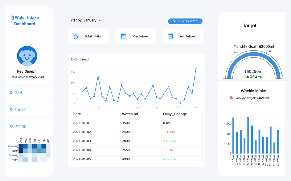
Pyscript DOM Manipulation
Having a look at our page everything loads up pretty fine, but two things remain:
Passing the statistic variables to the KPI cards
Adding interactivity to the dropdown element and download button.
How we fix this? DOM Manipulation.
What is the DOM? DOM in HTML stands for Document Object Model. It is a structured representation of a web page allowing access and modification to the structure and contents of that page. Learn more.
The document object represents your web page. If you want to access any element in an HTML page, you always start with accessing the document object.” — source
In the context of our code, this means we can easily get the contents of a specific HTML element and modify it based on some action we define. Thankfully, Pyscript has a replica of Javascript objects and functions that allow for DOM manipulation. Pyscript’s versatility also allows for DOM manipulation by integrating with Javascript or using the JS module of Pyodide.
Pyscript's document Attribute
To interact with the DOM in this tutorial, we’ll use the document object of Pyscript. Now, let’s define the display_stats() function for the summary statistics.
def display_stats(variable, target_id):
    document.getElementById(target_id).innerHTML =''      #step 1
    var = (f"{variable} ml")                              #step 2
    display (var, target = target_id)                     #step 3
The function above takes two arguments: a statistic variable and an output HTML id, and perform these three steps:
- Step 1: Locates the output HTML id using Pyscript’s document method and clears its content by assigning an empty string. This is very important to avoid creating another object when a drop-down menu is selected. The below image shows what would happen if this step is skipped.

Step 2: appends the stats variable with a suffix “ml”.
Step 3: A call to Pyscript’s display()
Pyscript display() vs Python print()
Pyscript uses a custom display() function to output python variables to the web page. In Pyscript, python’s built-in print() function is outputted to the browser’s console.
display() has two parameters; a python variable and a “target” id to output the variable. If you call display() without an argument to “target”, the output is a <py-terminal> element on the page.
Browser Events in Pyscript
The two browser events covered in this tutorial are a change event and a click event, for a Dropdown menu and Download button respectively.
Attaching an Event to the Dropdown Menu:
- Step 1: We create a Python function which takes in a “month” selected by a user, filters the data for only that month, and simultaneously calls each graphing function, passing the filtered data as an argument.
def plot_charts(selected_month):

   filtered_df = water_data[water_data["Month"]==selected_month]
   all_stats = total_month_stats()
   kpis = monthly_stats(filtered_df)
   line = line_chart(filtered_df)
   table = table_chart(filtered_df)
   circle = circle_chart(filtered_df)
   bar = bar_chart(filtered_df)
   heatmap = heat_chart(filtered_df)
   return all_stats, kpis, line, table, circle, bar, heatmap
- Step 2: To recap, remember our dropdown menu contained a
<py-change>event which linked to an undefined python function,dropdown_event
<select class="filter" id ="selected_month" py-change="dropdown_event">
Let’s define this dropdown_event function in our python script. Again, using Pyscript’s document method, it’ll get the value selected from the dropdown and make a call to our plot_charts() function with that value selected.
def dropdown_event(event):

  selected_month = document.getElementById("dropdown_menu").value
  plot_charts(selected_month)
Explanation:
<py-change> attribute (“dropdown_event” in this case). If such a function exists in the global scope, that is <pyscript src= “./app.py”>, it is invoked to handle the event. The linkage between the dropdown and the function controlling it is established through the attribute value <py-change= “dropdown_event”>. Note that a parentheses() wasn’t included while referencing the Python function in HTML. The syntax for handling events will vary across versions.Attaching an event to the Download Button
To do this we’d need a click event, that is, some action will be carried out whenever the button is clicked.
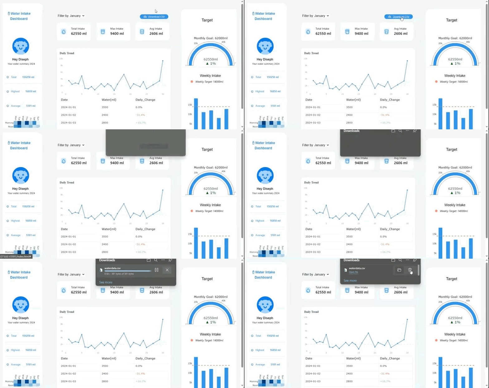
To recap, in the HTML file we created a download button which linked to a Python function download_file ;
<button id="download" type="button" py-click="download_file">Download CSV</button>
To create the download event, we first adjust the JS import statement to include some python-replicated Javascript objects.
from js import Plotly, JSON, Uint8Array, File, URL
Then we define the download_file function in our Python script to take an arbitrary number of arguments.
def downloadFile(*args):

    filename = "waterdata.csv"
    water_data.to_csv(filename, index=False)

    with open (filename, "rb") as data:
        my_stream = data.read()
        js_array = Uint8Array.new(len(my_stream))
        js_array.assign(my_stream)
        file = File.new ([js_array], "unused.csv", {type: "text/csv"})
        url = URL.createObjectURL(file)
        hidden_link = document.createElement("a")
        hidden_link.setAttribute("download", "waterdata.csv")
        hidden_link.setAttribute("href", url)
        hidden_link.click()
This function converts our dataframe, water_data, to a csv file, naming the file “waterdata.csv”. It opens a temporary connection to this file, reads the file’s contents and creates a Javascript array to hold this data. It then creates a new file object and generates a URL for this new file. Lastly, a hidden link is embedded using the HTML <a> tag. This link automatically triggers the browser to download the file “waterdata.csv” whenever the button is clicked.
Putting it all together!
Finally, we make a call to plot_charts() with a default option, “January” (else the dashboard would be empty initially).
#rest of your code

plot_charts("January")
And viola!
Live demo: https://disephd.github.io/Pyscript-Dashboard/

Insights from the data
Here are a few conclusions we can derive from this data.
My water intake was at the highest in January: and that’s true because it was the beginning of the year, and my motivation was high.
I tend to drink more water in the mornings- which is when I do a lot of physical activity.
My water intake was at the lowest in March: not entirely true because I was mostly busy and didn’t have time to keep track of my water levels.
How accurate is the data? Well, not so much. Because since it was entered manually, it relied on my remembrance of when and how much water I drank whenever I did not log my records immediately. This can lead to the error of double-counting, thus leading to inaccuracy.
Conclusion
We just created an interactive data-dashboard web application using Pyscript; we structured the page using HTML, created the Python charts using Plotly, parsed the Plotly charts as JSON, manipulated the DOM by adding a dropdown event and a download event, and even got a few insights from the data, all aided by Pyscript! That was a lot and there’s so much more you can do with this tool!
Overall, I believe in Pyscript because ever since its release in 2022, the Anaconda team has not relented in updating the platform, and the Pyscript community is also very active. Personally, I see myself employing this tool in future projects.
I hope you enjoyed/found this tutorial helpful, be sure to follow for more original Python contents. If you also have any thoughts or questions feel free to leave a comment. Farewell Pyscripter!

